Have you been using Dynamic Views on your Blogger blog? :) I'm sure you are attracted to those elegant templates developed with modern web technologies. Easy to use and manage, but unlike the usual layout templates, customization and gadget support is still limited. But don't lose your hopes, 'cause Blogger team is working on it. Now, it's not about upcoming features I wanna talk about. How do you feel about allowing visitors to switch among other dynamic views?
Showing posts with label CSS. Show all posts
March 15, 2013
February 7, 2013
Easily Add Custom CSS to Your Template in Blogger
"Now all you need to do is copy below CSS code snippet into your blog template and it will turn your background color into green." Are you familiar with such instructions? If you have been visiting my blog for a quite time, you might have heard of it for sure when it comes to tutorials related to design. If you are looking for customizing your blog's look and feel, CSS (Cascading Style Sheets) is where you need to focus on, 'cause HTML alone doesn't help on styling your blog template. That's where you will need some knowledge in CSS or else you need to know where to use CSS code snippets provide in tutorials on web space.
October 1, 2012
Create Transparent Effect for Your Images on Mouse Hover
Have you been using images on your blog or website? I believe whether you are a blogger or a webmaster, you are familiar with the usage of images on a site. There is a higher tendency that visitors spend more of their time on pages with images or such media, instead of text-only pages. Isn't it obvious that our eyes go straight to images and styles on a web page as we scan through the page? Now think, where would you use images on your blog or website? Can be anywhere - in posts, on header, on sidebar or even on footer. They can be banners, sponsor advertisements, follow buttons, site header or such common elements. Rather than displaying them with a static motion, wouldn't you love to add a cool effect for such images to improve visibility and grab more attention of your visitors?
February 29, 2012
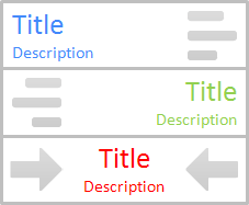
How to Align Blog Title and Description Header Texts in Blogger
Lately we have been talking about changing or customizing Blogger header as you like with available options. However you can go beyond those limitations and add a whole new custom header for your blog if you need. If you are not much familiar with HTML or do not wish to spend more time on adding a custom headers, you might have to satisfied with available standard Blogger customization capabilities. If you consider about text displayed on header which are blog title and description, Blogger let you customize font and color of blog title and description via Template Designer. But does it let you change their text alignment?
February 20, 2012
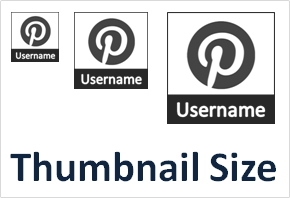
How to Change Thumbnail Size of Popular Posts Widget in Blogger
How do you promote your posts in Blogger? You can easily show related posts underneath each of your individual posts for your readers. Or you can recommend most relevant content on your post pages. Else you can display most shared and recommended content on Facebook by adding Facebook Recommendation Box to your blog. By using these methodologies, absolutely you can grab more attention and increase page views for archived posts. In addition, Blogger let you show off popular posts within specified time range using official Blogger Popular Posts widget. If you already using Popular Posts widget on your blog, sometimes you may concern about its thumbnail size as it takes more space on your blog. Due to this reason, you may disable thumbnails. But rather than disabling it, would you like to change size of thumbnail images shown on Popular Posts widget?
June 22, 2011
How to Edit "Subscribe to: Posts (Atom)" Feed Link and Message in Blogger
Did you notice the Subscribe to: Posts (Atom) link on your blog? You can find it near the blog pager at the bottom of your blog. It's a feed link in Blogger that enable users to subscribe for your blog posts via feed reader to notify updates about new posts. It sounds confusing for some readers who doesn't know about it. If you offer a way to subscribe for your posts via feed, then you might find it unnecessary too. Whatever your requirement is, I'm gonna help you edit this link. Do you need to hide or remove it from your blog? Or just need to change the text of that link? Let's figure out how to.
June 5, 2011
How to Remove Post Date Header in Blogger
On the Blogger platform, you may have seen a header line with date above the posts on homepage. It's the date header and the posts published on that particular day will list under that date header. If you don't seems to like the way it is, you would try changing date header format with available options. You may satisfied by changing date format. But if not, you may prefer to show publication date with each of your posts or planning to show it anywhere else suitable for your blog theme or design. Therefore you would like to hide date headers from your blog as you are working on an alternative. Are you desperate to know that how to get rid of those date headers?
Customize Post Footer in Blogger
As you manage your blog, you have to be more specific in offering quality content for your readers. It should be relevant and unique. However content is not the only aspect you wanna consider when it comes to blogging. You have to think about look and feel of your blog, the services you are offering to your readers to feel them comfortable in reading your content and much more. When is comes to Blogger, specifically, they don't have huge number of plugins to play with. So you may prefer to customize available and make use of them to your blog. One of such element you should not forget about is post footer. Absolutely you know what it is and it appears right beneath your post. Would you mind customizing your post footer?
June 1, 2011
Hide Post Footer from Homepage in Blogger
How much do you care about your blog design? It matters, yeah. Your blog design matters as it represent your personality and no... no... don't ever think about copying someone else's design. Yeah, it's alright if it's available for you or you build similar with your own efforts. Else you just don't show off yourself. It's true that design doesn't matters mostly but some people identify when they see you are using someone else's design strategy. However try to be unique with designing and customize it as you need. When it comes to customization, you may have seen that Blogger show post footer end of each post. You may feel it's perfectly alright to show at post pages, but you may not like the fact that it's visible on your homepage. It depends on your choice. Wanna get rid of post footer from your blog homepage?
May 28, 2011
Remove Blogger Post Image Shadow and Border
Have you ever attached images in your posts? Most probably the answer would be 'Yes'. But after publishing your post, you may have seen that your image has a shadow and a thick border around it. Sometimes you may wonder how it appears after publishing the post, 'cause if you go back and edit your post again, you won't find any border or shadow there. So you have nothing to do at the Post Editor to remove border or shadow. You may find no clue about that. But that shadow and border appears around your images may still bugging you. Are you still wondering how to get rid of such shadow and border appears on your images in Blogger?
May 15, 2011
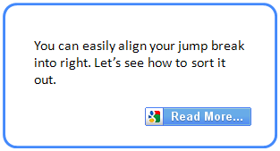
How to Align Jump Break to Right in Blogger
Have you ever seen links such as "Read More..." or "Continue Reading" after landing on a homepage of a blog? In most scenarios, they display a snippet of a post and want you to click on that link to read whole article or story. It's saving space on homepage and able to display more posts to grab more exposure and increase engagement. Also as you make use of jump breaks in Blogger. You can specify which snippet should be displayed on home page and a "Read More..." link will appear after the snippet. Every component displayed on your pages relevant when you think about design of your blog. Typically the jump break link is aligned to left side. Would you prefer to have it other way? I mean, on right side.
Subscribe to:
Posts (Atom)